Friday, November 9, 2012

Final thoughts.

Final thoughts.

So, the presentation is over, the semester is nearly over and I will (hopefully?) soon be graduating. To be honest, I am sad that there is no more time for me to refine this project... but I believe the overall outcome itself was satisfying. I have learnt many many things during this project, although when Ruwan asked me what I had learned after I finished my presentation I replied with "I'M FREE FOREVER!!!!!!", probably was't the best thought out response as in reality, I have learnt A LOT. 
In fact this project was possibly the most challenging, and I wish in some ways that the challenge was not over. 

The main challenge was not in formulating a proposal or design, rather it was providing a sufficient  detailed visual display of my future concept which was extremely organic in form. In previous projects I was only limited to abilities within AutoCad and Google Sketchup and was hoping my design could be quite inorganic in form.. I suppose that would have been the easier option, but I was determined to put my sketches to a 3D modelling platform and show a "different" style of design. My tutor Ruwan was a great aide in this adventure and introduced me to the mindset where 3D modelling is not that scary, initially starting with a basic model in 3Ds MAX. I was inspired by how swiftly Ruwan could use this program and create complex shapes, and decided to download the program and try it myself at home. What a disaster it was - I could barely rotate the screen or create a box, how could I possibly create a building.. Good thing that nice people have posted an array of Youtube videos online for lost and confused people. 
I had great expectations to use this program as Ruwan showed me a few tips and tricks a week in our tutorials, however I still somehow could not fully grasp the structure of the program and downloaded the MAYA instead. This intially was also a disaster as I quicky found there was not as many nice people posting Youtube tutorials about MAYA than there are about MAX but I really enjoyed the interface of MAYA over MAX and found it easier to navigate. Thus, after sleepless nights and sleepless nights scavenging for tutorials I was able to produce my conceived desired design and my 3D modelling challenge (which I posted about earlier in this blog) had been overcome. Huray! It makes me sad that I had not had a tutor in my  previous projects open my eyes up to the possibilies of using such programs for architectural design. Another couple of programs which I decided to learn virtually overnight was Adobe Illustrator and Adobe After Effects. The use of Adobe Illustrator was again inspired by my tutor Ruwan who mentioned that the drawing tool could be used to trace over a Google Sketchup model to create clean diagrams. I really wanted to have this visual effect and used the program for my sections and floor plans.

The presentation itself was not entirely successful and I am rather disappointed in how it turned out. I foolishly tried to play my After Effects 18GB introduction video file using the university computer which simply could not handle the graphics and caused the video to skip/lag continuously throughout.. Good thing it was only 1:48 minutes... My links in the second PowerPoint presentation did not work as the internet was not connected and I also did not sleep at all the night prior and was running on energy found from a morning coffee(s)...  
After the presentation, I am not entirely sure if the feedback I received was negative or positive as the secondary guest tutor only commended on my digital presentation skills and not the design itself. My tutor Ruwan mentioned that my design is not conventional and is definitely a "future" design.
I am hoping that my unconventional design was received well as I definitely did not play it "safe" for this project and wanted to do something which defined what a FUTURE proposal would be, through its structure, form, what it provided and what it could do beyond year 2030. I feel I should do o.k at the least as my design was reviewed each week during tutorials where I had only not spoken to my tutor during one tutorial lesson that I could not attend, combined with the ongoing process and refinement I had undertaken each day to create the final concept.

Here is the PowerPoint presentation - please view with LiveWeb to enable the interactive web content I had added: https://www.dropbox.com/s/ni2wmicc3jhbize/DAB810%20Nikki%20Seeto.pptx


Below is the A1 Poster submitted with the presentation, as this poster was generally meant to provide a quick overview of my project rather than serve as a "marked" poster  I decided to simply include a selection of presentation images to give a efficient outline of the project.


Final Slides Overview

Below are a few of the final detail slides used in the presentation (not in order) which served to be a step by step explanation of the process undertaken to create the final design. Overall I am satisfied with the outcome and what I was able to achieve given that I had only learnt the 3D modelling program a couple weeks prior to submission. I have written a brief explanation of each slide under the images.

After trialing various attractor facade sytems, a flexible, adaptive facade system which was designed to wrap around the spherical skin . Effectively, individual triagular mechanisms dialate with solar interaction.

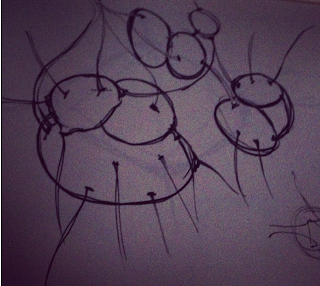
I was interested in expanding my pod design for beyond year 2030 into a generative eco system which hosted various pod designs and would have a growable structure borrowing the Protocell technology from Rachel Armstrong where engineered microscropic cells have the ability to grow, mould and harden over a surface. I believe by utilising this technology would serve as a wholly sustainable solution to provide for future Brisbane City.

A key part to refining my previous group's future scenario was the realistic inclusion of flood channels throughout Brisbane City due to rising sea levels and an increase in flooding as a result of the thinning O-Zone layer. As the flood channels proposed by the government have only just begun in year 2030, the first stage of the initiative was to place a major flood "artery" within the former Queen Street Mall. This scenario was key to my future design as I sought to utilise the Brisbane River.

The internal structure of PARAp*oduce was inspired by the Radiolarian cells which generally grow in the ocean. These living organisms include key elements such as a nucleus, skeleton, structure and protruding feelers. PARAp*oduce uses biomimicry quite heavily in its design and included a central core, a layers structure and facade system and connective skybridges and valves.

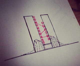
To satisfy the growing CBD population I found it was neccesary to connect the city and it new residents, and found that by placing nodes on major buildings, a network of smaller nodes could be made which served as a framework to service the city population.

The initial structure of the future pods would be a realistically manufactured procedure and includes a reflective shell, structural framing, flood plates and a facade. With an increase in technology this structure is envisioned to be generative in design with the use of protocells and organic fibre composite. The skeleton should vary dependant on the weight strain, where structural rings increase where weight load increases.

The PARAp*od network serves to be parasitic and utilises adjacent buildings with the Growing Pods as major access points, and sky bridges connecting to other pods within the network.

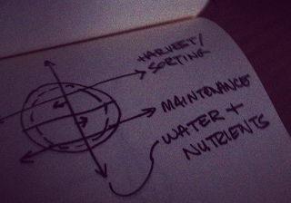
With a view to be a entire network of generative "pods" the future design focused only on the three major contributors to the Urban Sky Farm system. The system consists of a Growing Pod, a Nutrient Pod and a Filtration Pod. The Brisbane River is utilised to provide water and fluids to plants and is filtered, enhanced and served within the network.

The cirulation of each pods serves to be simplistic and provided as much space as possible for plant growth or other uses. Vertical circulation is through the central core and boundary paths.

Physical Models

During the start of this project I had always envisioned my design to be quite organic  in form and realised the best way to create physical models would be to utilise the 3D printing facility available at the D Block workshop. I have used this service once before and for a beginning user I knew there would be a few bumps to over come before the 3D file could be processed for printing. The below images are the final result after numerous attempts and edits made to the original file to ensure the digital model was suitable. The files was a headache to do but in the end I am somewhat happy with the final product. I am not overlly satisfied as I would have liked to create a 3D model which shows the sphere pods connecting but as I did not have a great deal of time, I did not want to take a risk incase the models did not turn out well. I decided to 3D print a series of four pods which show the "evolution" of the architectural material as it grows over time, with the help of proposed future technologies.


The Intro Video Presentation...


Larger version: http://youtu.be/z1iwHUeStr4

As part of the criteria of this project, I sought out to find a practical and engaging method to introduce the "story" of my future scenario and architectural future solution. I decided not to completely rely on Microsoft PowerPoint to show my story as I felt this method would be expected and was limited to basic tools. My aim for this video was for it to serve as an introduction to my architectural proposal, and set the scene for why my proposal is neccesary due to the current needs of my future citizens. After google-ing variou video marking platforms it was clear that I wanted to use Adobe After Effects although I had not used the program before. During out last tutorial where we had one last opportunity to speak with our tutor about our project, Ruwan showed us an example of an infographic video, although I only saw this video for a minute or so, I was really interested in utilising the style of infographics into my video, and I tried my best to do so with the limited time we had. During the presentation however, I learnt that it would have been a good idea to compress the 18GB file as the uni computer good not handle the size of the file and lagged quite alot... so unfortunately the audience had to sit through a lagging presentaion, but the message got through (I think).

Wednesday, November 7, 2012

Changed title!

I have updated the blog title image as during the project I had decided the name PARAp^oduce is more suitable given that it is parasitic in form, and delivers fresh produce through various pods.
FORMER image which served until November 6th.


NEW image updated on November 6th.

Monday, November 5, 2012

Renders

Here are some of the final renders I used during the project which show different perspective views of the main Growing Pod. I believe this pod design can not only be used as a a farming space, rather is quite versatile to be used for other various future uses/requirements.